Portfolio / Lucybeau
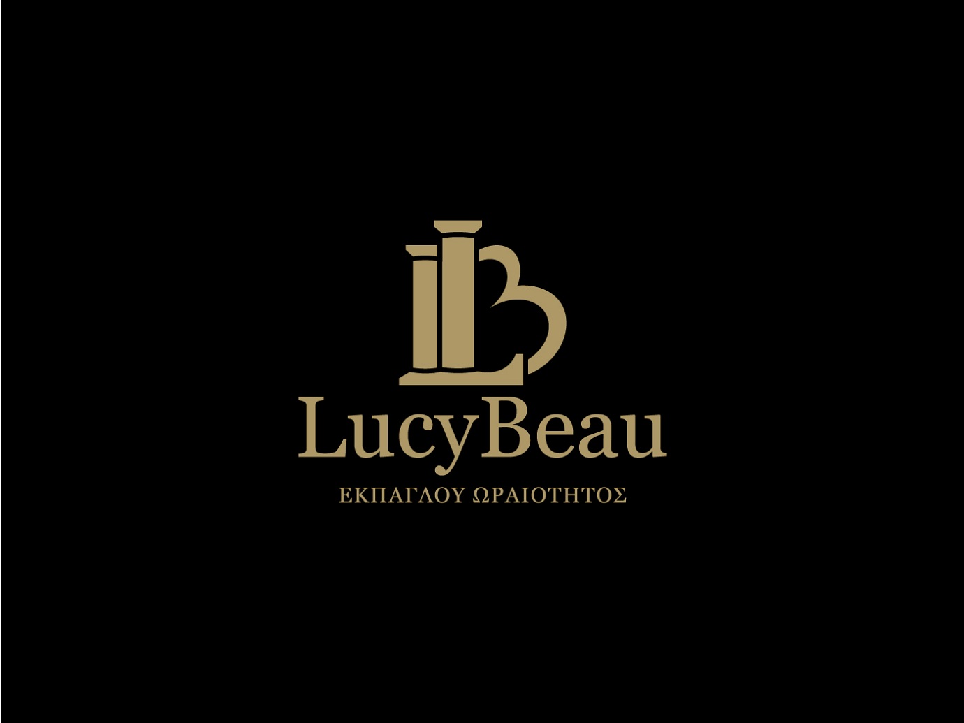
Lucybeau — lettermark logo for a cosmetics and lingerie company
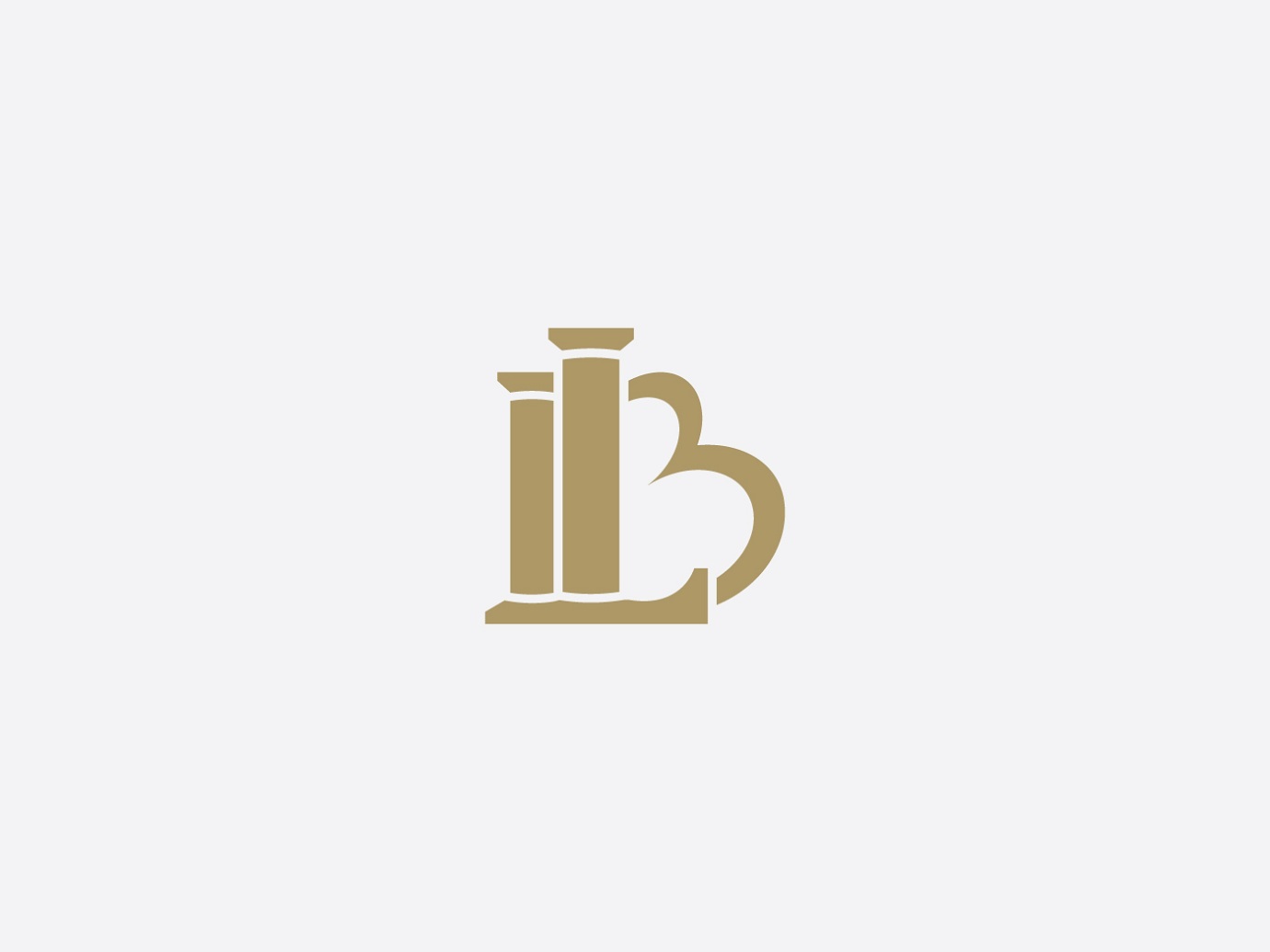
A geometric lettermark for a cosmetics and lingerie brand: the L stands as a column, the B rises like a sun.
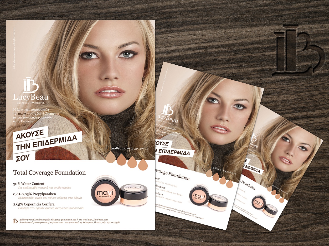
What I did
- Logo design
- Logo monogram mark
- Wax seal stamp
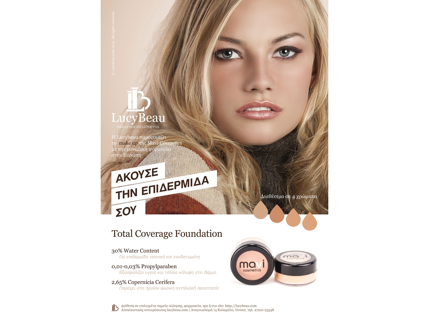
- Print advertisement & flyer design
- Logo applications
The approach
Beauty is governed by geometry and symmetry, so the mark was built from the initials with both in mind.
The L is drawn as a column — stability and endurance — while the B rises like a sun, communicating love, hope and safety to customers choosing an intimate product.

Need a brand people remember?
Tell me about your project and I'll reply within one business day.
Get in touch