Portfolio / GL Insurance
GL Insurance — logo design for an insurance agency
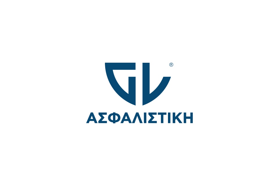
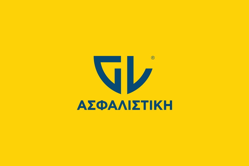
A shield-based logo for an insurance agency, with geometric G and L initials communicating precision and reliability.
What I did
- Logo design
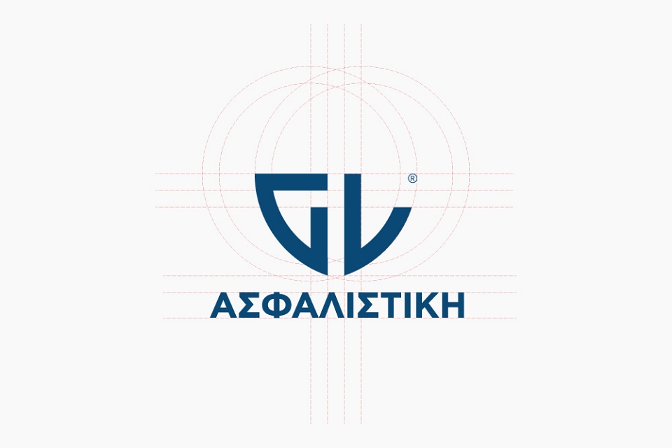
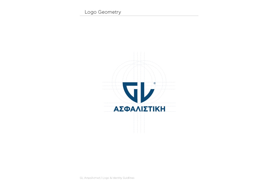
- Logo construction grid
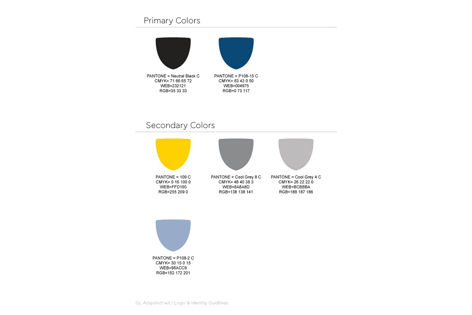
- Brand colour palette
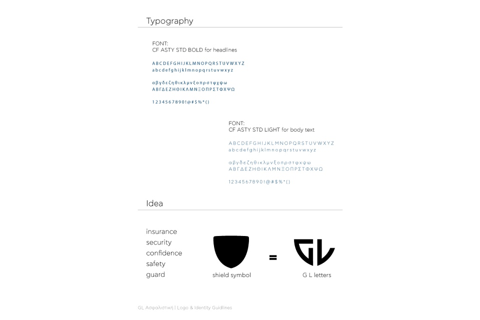
- Typography guidelines
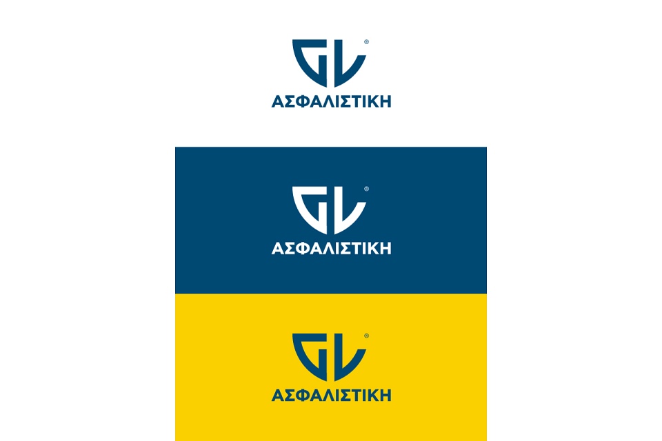
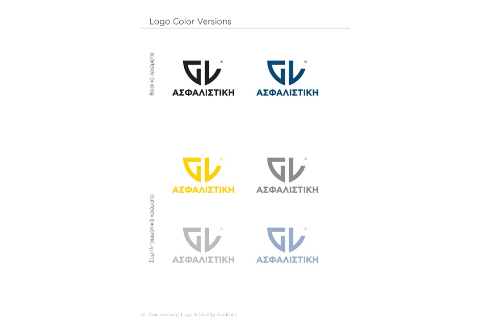
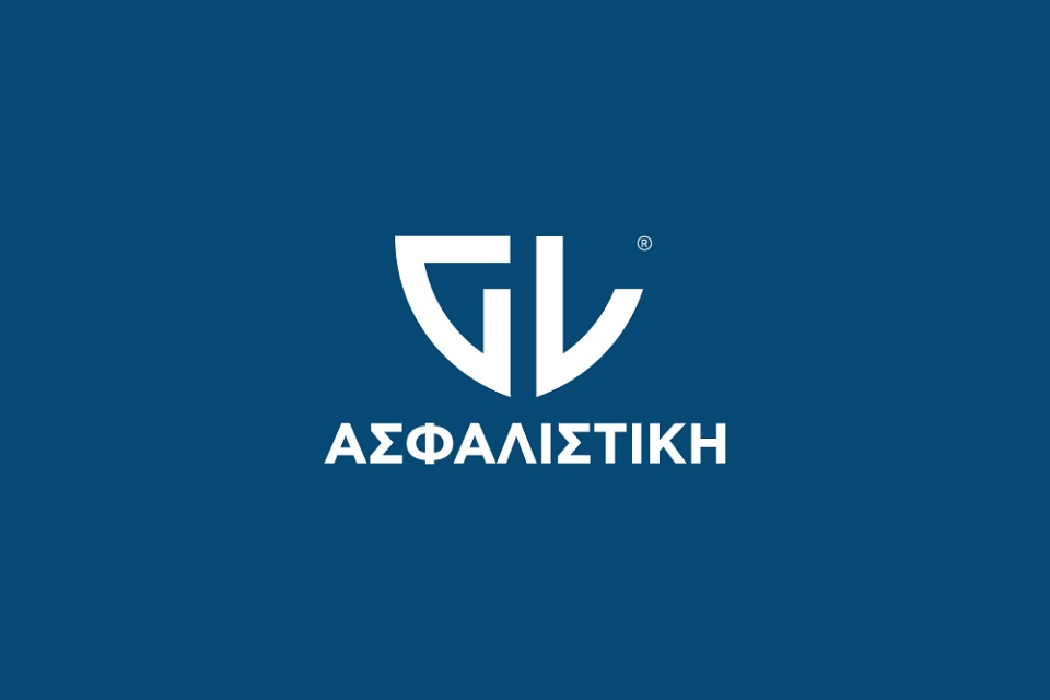
- Logo colour variations
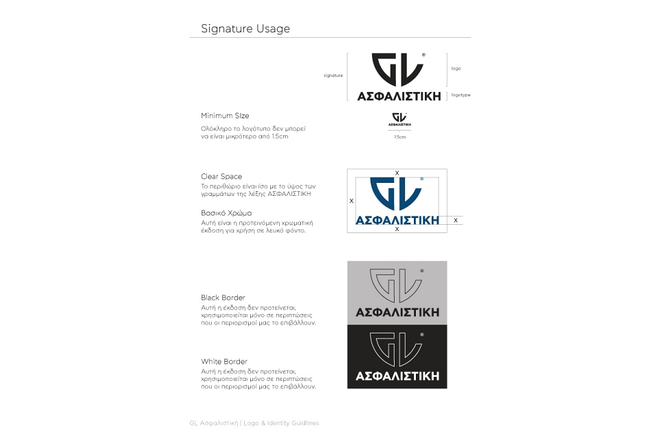
- Clear space & minimum size rules
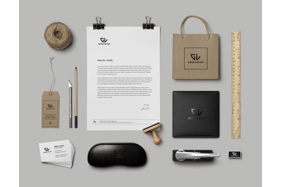
- Business cards
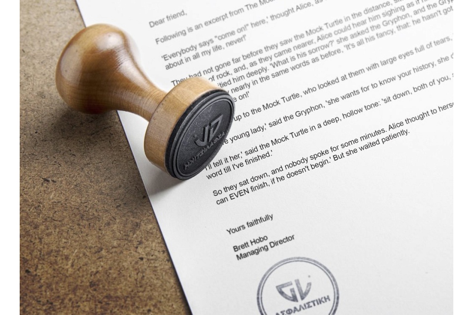
- Letterhead
- Stamps
- Bags & boxes
- Branded merchandise (case, tie clip, pin)
The approach
Insurance sells peace of mind, so the mark uses a shield — a symbol of safety and standing, borrowed from heraldry.
The G and L initials are drawn geometrically and symmetrically for precision and consistency, and the structure holds up in one colour, in any print process and at any size.
Need a brand people remember?
Tell me about your project and I'll reply within one business day.
Get in touch