Portfolio / Diabetes Surgery
Diabetes Surgery — brand identity for a medical practice
A complete brand identity built around one idea: medical excellence combined with genuine human care — from the symbol and colour palette to icons, patterns and real-world applications.
What I did
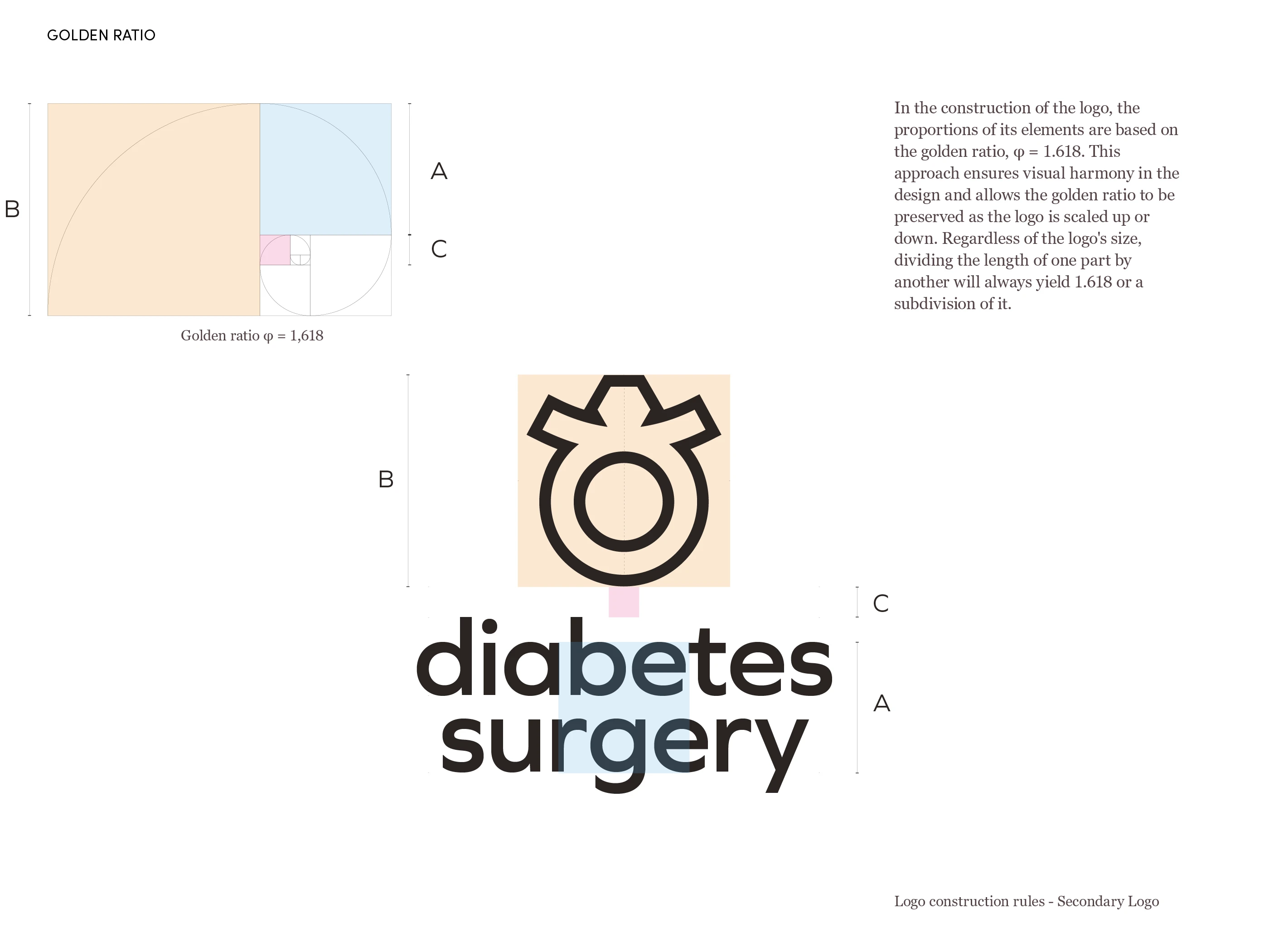
- Logo design & symbol concept
- Logo variations
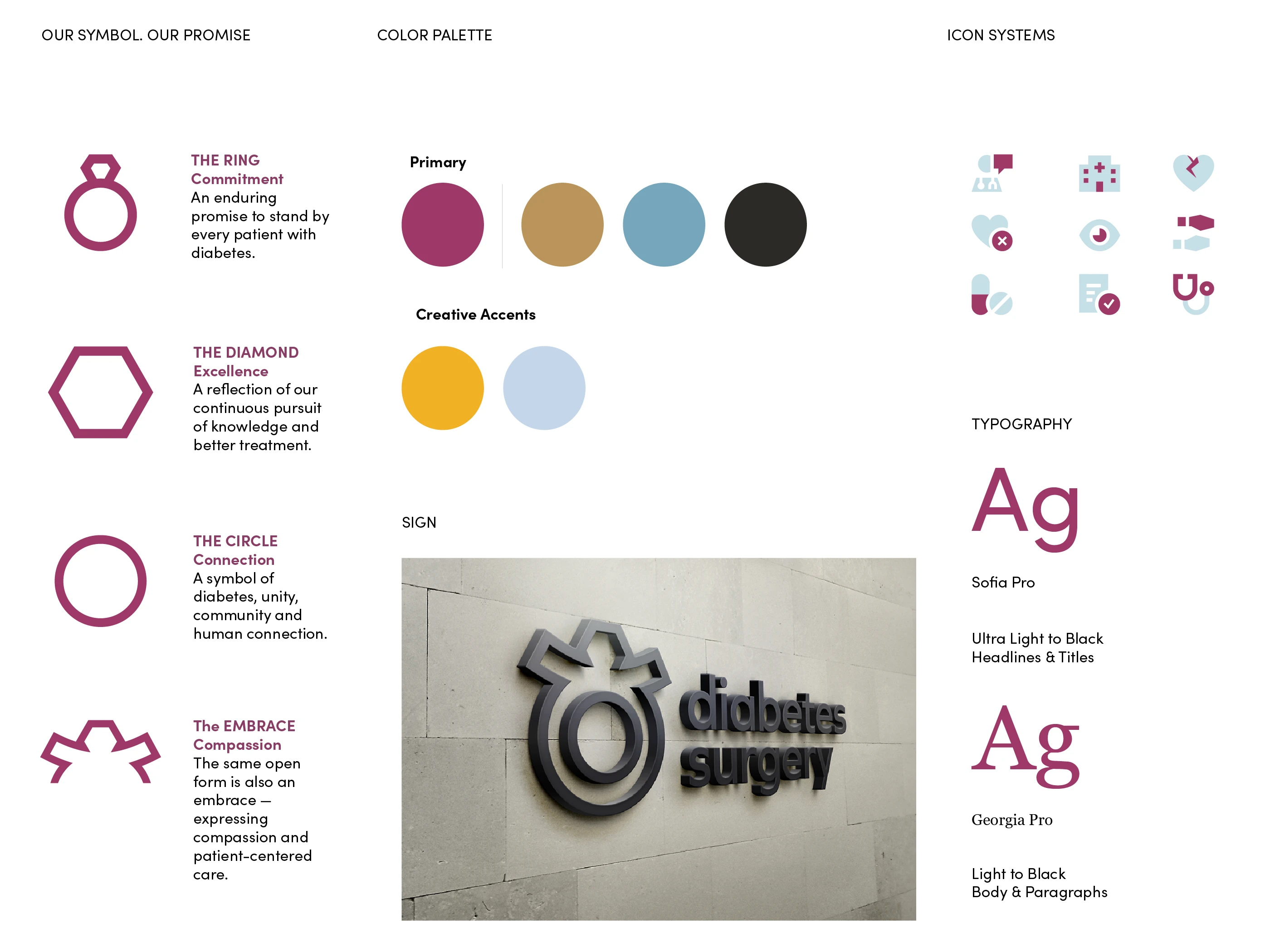
- Colour palette
- Typography system
- Icon system
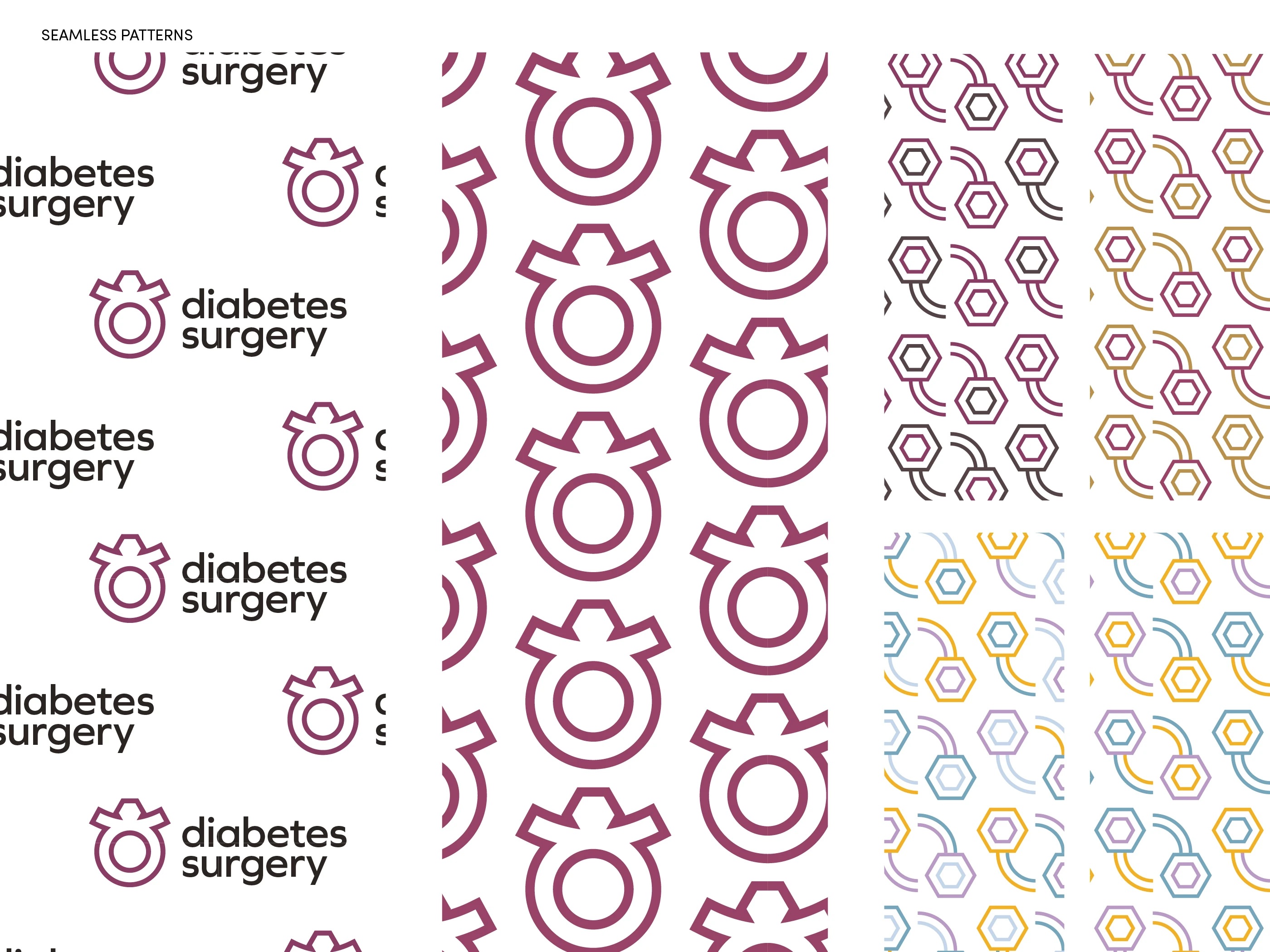
- Pattern design
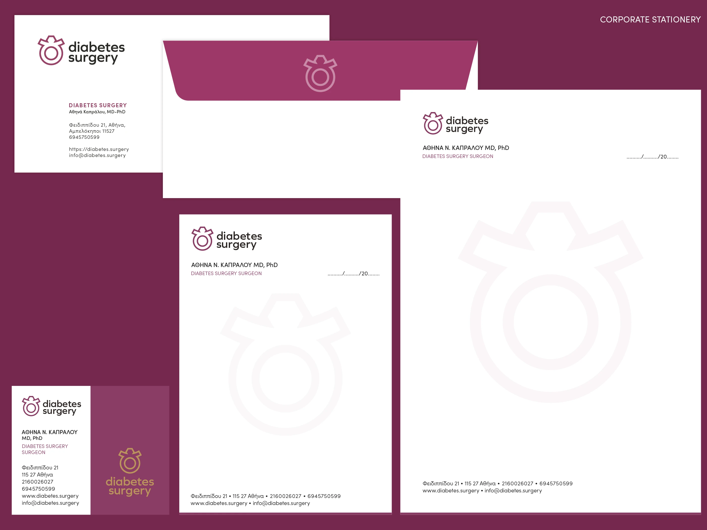
- Corporate stationery
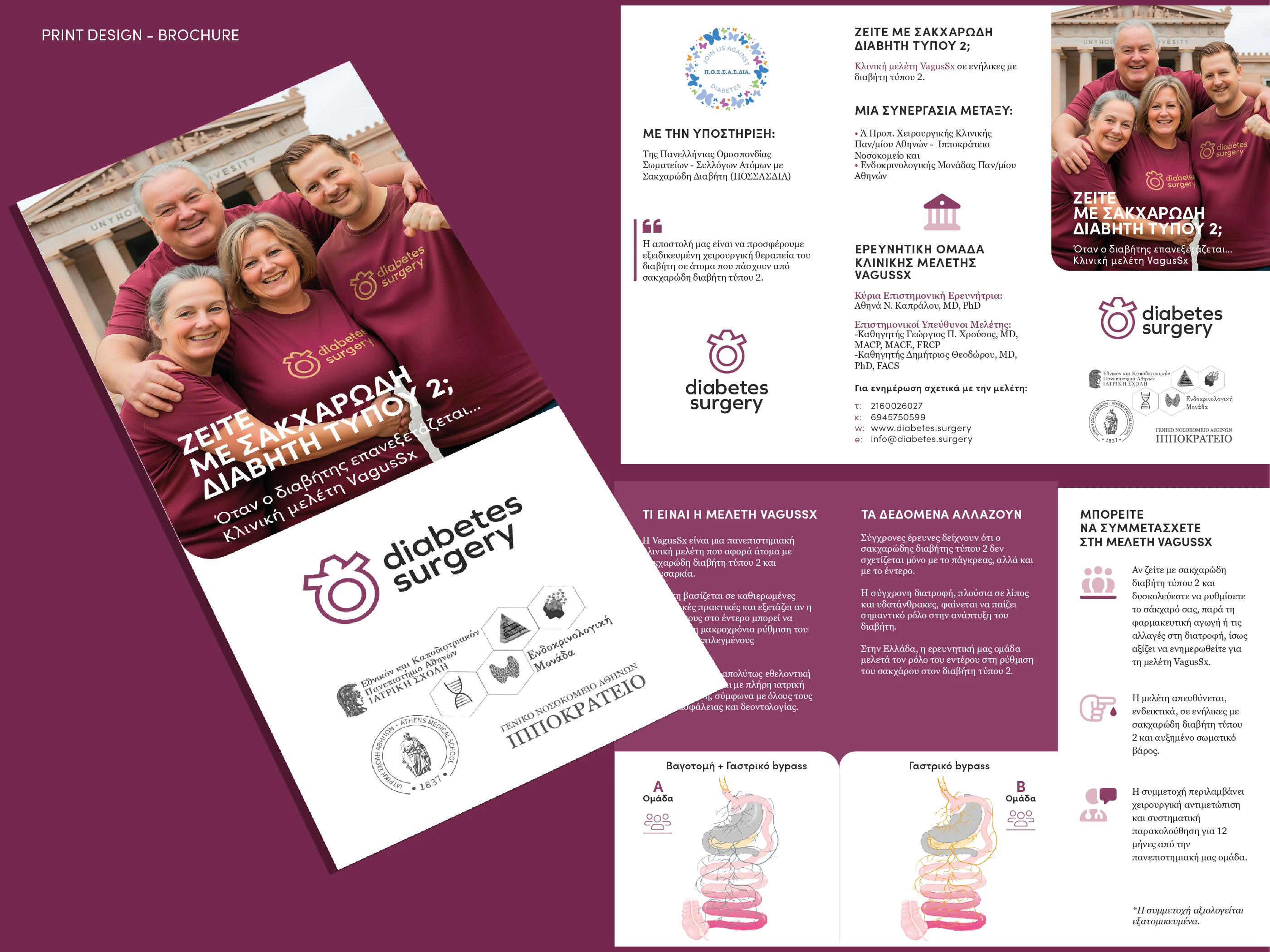
- Medical communication materials
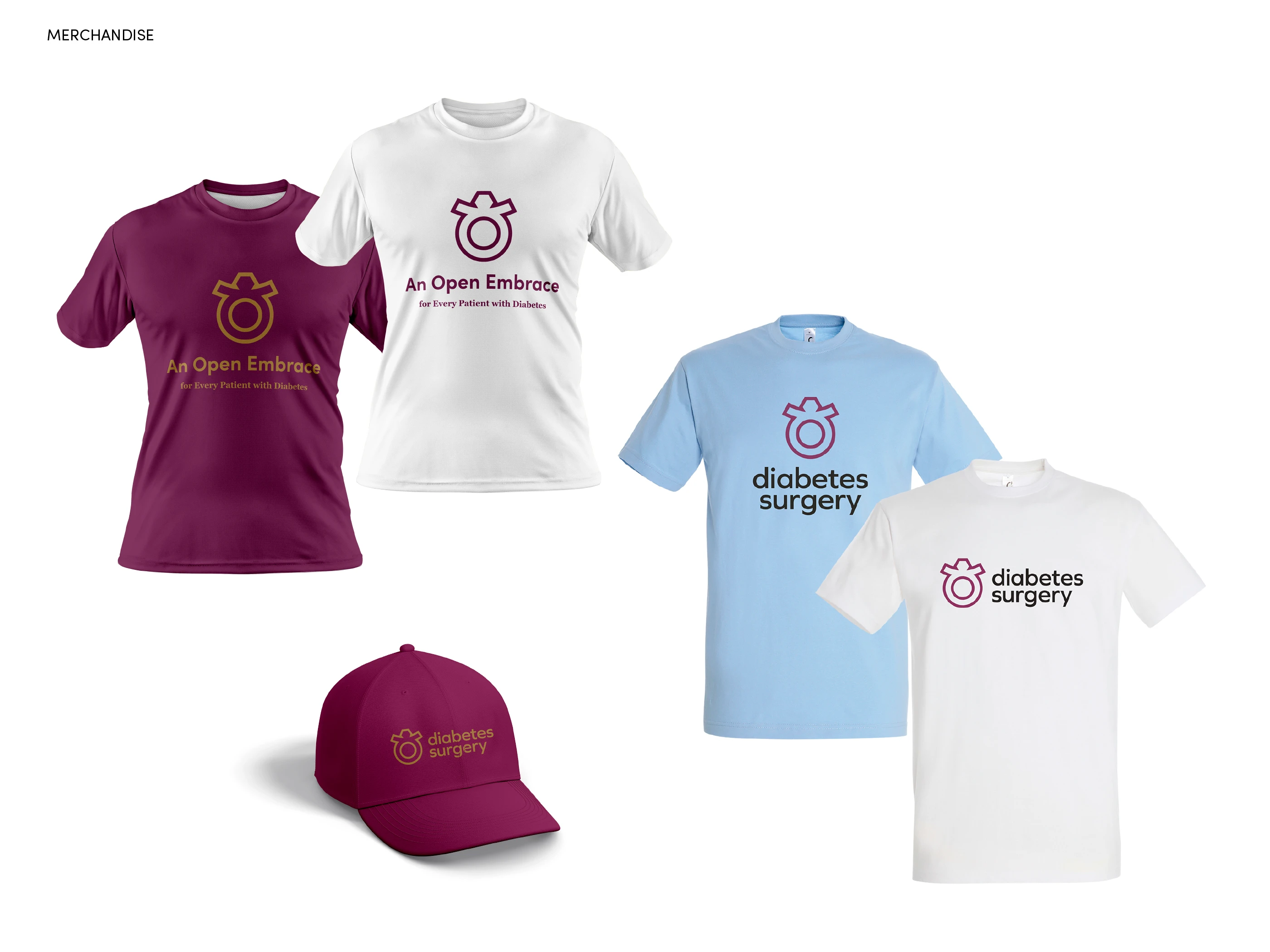
- Merchandise
- Print design
- Custom WordPress website design
- Custom theme build with Bricks Builder
- Design system implemented with Automatic.css (ACSS)
- Responsive layout & on-page SEO setup
The approach
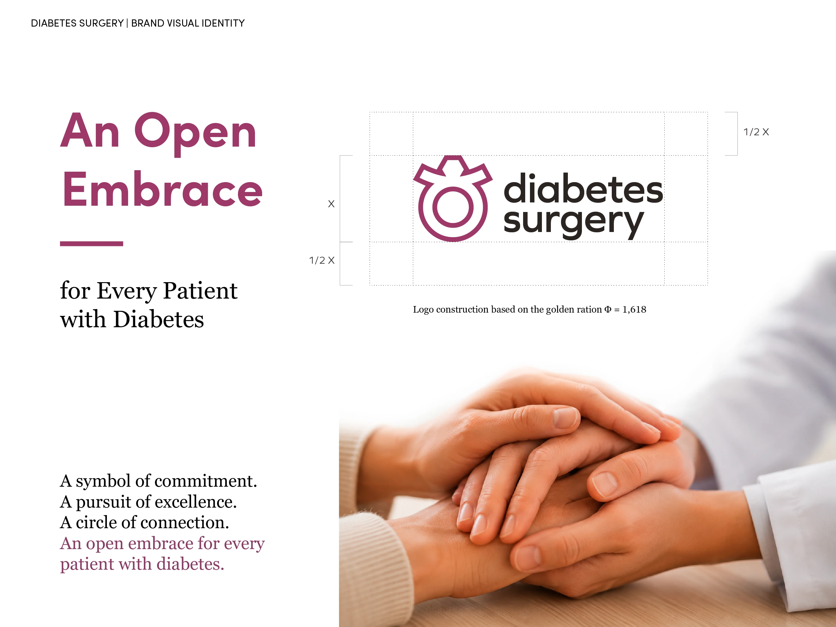
At the heart of the identity is a symbol inspired by a solitaire ring and transformed into an open embrace. The ring stands for commitment, the diamond for the continuous pursuit of excellence, and the circle — also the universal symbol of diabetes — for connection, unity and community. Its open form turns the mark into an embrace: compassion, empathy and patient-centred care.
A symbol of commitment. A pursuit of excellence. A circle of connection. An open embrace for every patient with diabetes.
The identity was developed from the ground up and extends consistently across digital and physical touchpoints — stationery, medical communication materials, iconography, patterns, merchandise and print — for a system that feels professional and medically credible while staying approachable and deeply human.
The website is a custom WordPress build: no off-the-shelf template, but a bespoke theme created with Bricks Builder and an Automatic.css (ACSS) foundation, so the brand's spacing, colour and type scales live directly in the site. The result is a fast, fully responsive site that the practice can update easily.

Need a brand people remember?
Tell me about your project and I'll reply within one business day.
Get in touch