Portfolio / Apilif
Apilif — logo design for a honey and food products company
A combined logo — a rough-lined bee plus a vintage wordmark — designed to raise the perceived value of a honey producer's products.
What I did
- Logo design
- Logo colour variations
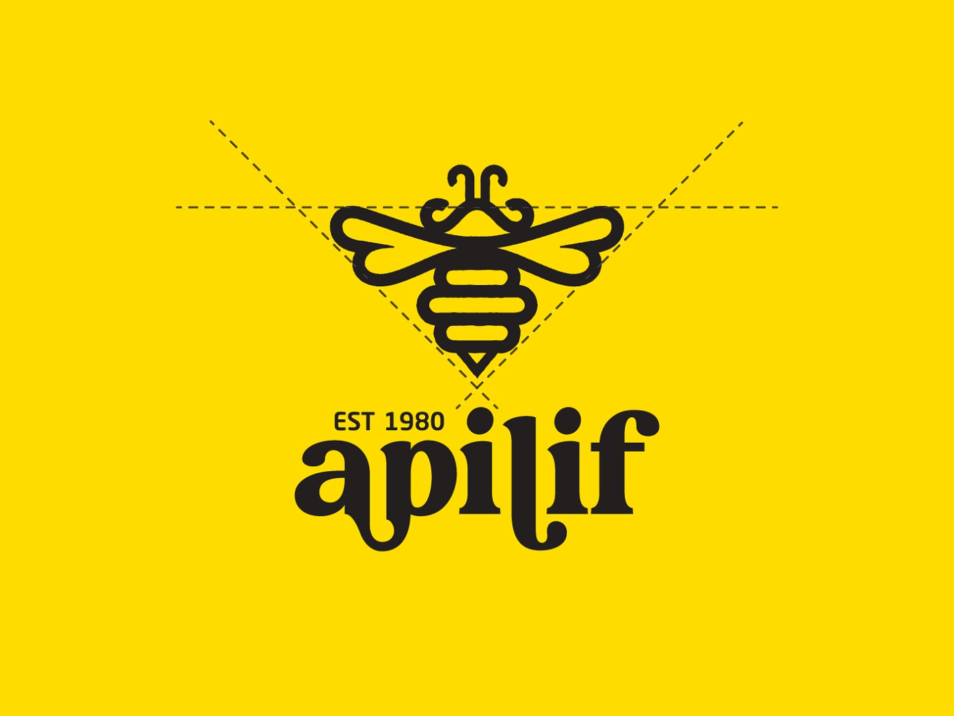
- Logo construction grid
The approach
The bee is drawn with rough lines and paired with a vintage typeface, so the mark reads organic before you read the name.
On the construction grid the bee resolves into a right triangle — a shape that carries a sense of harmony and change, and keeps the icon geometrically sound at every size.
Need a brand people remember?
Tell me about your project and I'll reply within one business day.
Get in touch